English
 Français
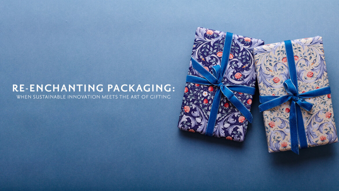
Re-enchanting Packaging: When Sustainable Innovation Meets the Art of Gifting
At IMPRESSION ORIGINALE, we believe that every gift deserves a wrapping worthy of it. More than just paper, packaging becomes here a means of artistic expression, a gesture of care—and above all, a commitment to a more responsible future. As the packaging industry rethinks its fundamentals, we embrace a vision where beauty and sustainability go hand in hand.
Elegant Commitment: 100% Recycled, 100% Made in France
Our ambition is to place gift wrap at the very heart of the gifting experience. Not as a disposable embellishment, but as an object of transmission—beautiful and conscious of our environment.

@IMPRESSIONORIGINALE
Elegant Commitment: 100% Recycled, 100% Made in France
Our wrapping papers are made in France using recycled materials—without compromising on quality or design finesse. This local and circular approach has never been optional; it lies at the heart of our philosophy. It ensures full traceability, drastically reduces the carbon footprint of transport, and supports exceptional French papermaking expertise. Our paper is eco-designed: it’s neither chlorine-bleached, nor plastic-coated, nor metallized. Instead, it stands out through its natural texture, high-definition mechanical printing, and meticulous finish. And because every beautiful gesture should be complete, our paper is also fully recyclable after use.
When Packaging Becomes a Matter of Innovation
Around the world, young companies are redefining the materials of tomorrow—and these breakthroughs inspire us. So we talk about them.
In Estonia, Kiud transforms textile waste into rigid sheets for luxury packaging, durable and reusable up to 20 times. Sparxell, a spin-off from the University of Cambridge, develops pigments made from cellulose—biodegradable and free of toxic dyes—that revolutionize how we perceive color.
Meanwhile, the Gozen studio is crafting a translucent material based on nanocellulose—lightweight and flexible, capable of embracing the boldest shapes in fashion and design. In a similar spirit, Releaf Paper offers a pioneering alternative: producing paper from urban plant waste, especially fallen leaves. Each year, a mid-sized city collects around 8,000 tons of leaves—over a million tons at the European level.
Instead of incinerating or landfilling them, Releaf transforms them into wood-pulp-free paper with an ultra-low carbon footprint (0.066 kg of CO₂ per kilo). The result is a renewable, recyclable, forest-friendly paper. A brilliant solution that proves sustainable innovation can emerge from what we once considered waste.
These initiatives show that it’s possible to combine creativity, circularity, and performance—without sacrificing sensory appeal or refinement. They fuel our research and inspire us to go further in our own journey.
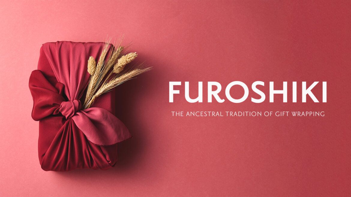
Wrapping Paper as a Manifesto

@IMPRESSIONORIGINALE
Gifting is, above all, about sharing emotion. At IMPRESSION ORIGINALE, we see every pattern as a standalone artwork, created by artists from around the world. The paper becomes an extension of the gift—and often, a lasting memory of it.
Our ambition is to place gift wrap at the very heart of the gifting experience. Not as a disposable embellishment, but as an object of transmission—beautiful and conscious of our environment. Finally, beyond choosing new materials, we give our ribbons a second life—both artistic and sustainable.
Some are hand-calligraphed to become unique decorative elements, while others are woven into new creations using leftover ribbon scraps. A way to recycle with elegance, and to extend the story of each piece.
Tomorrow, Between Art and Material
As the boundaries between craftsmanship, technology, and responsible design continue to blur, we remain committed to our mission: to replace the fleeting with the precious, the disposable with the desirable.
And together, let’s turn our responsible gifts into lasting emotions—memories that endure.

@IMPRESSIONORIGINALE
Behind the Scene
IMPRESSION ORIGINALE shares its know-how with a behind the scene of our ribbon masterpiece. Our founder, Mathilde, believes in the strength of giving and sharing her wonderful skills to support your own creating gift-wrapping capacities from simple to elaborate tutorials suitable for all skill levels. The secret resides in gifting your loved ones with attention, care and taking your time.
")